What it is
Explaining how a colorblind person sees is impossible. Showing it is not.
I'm colorblind, and I was tired of apps that show me what I'm missing. I built one that shows everybody else what I see.
1 in 12 men has a color vision deficiency, and until now had no way of showing anybody how they see. This app is that way: you set up how you see and you send it as a link, and at the other end your mother, your partner or your boss sees the world the way you do, in their browser, with nothing to install.
Why I made it
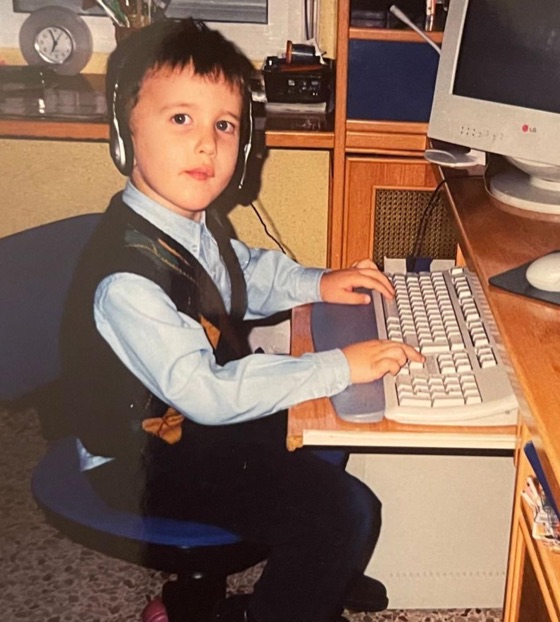
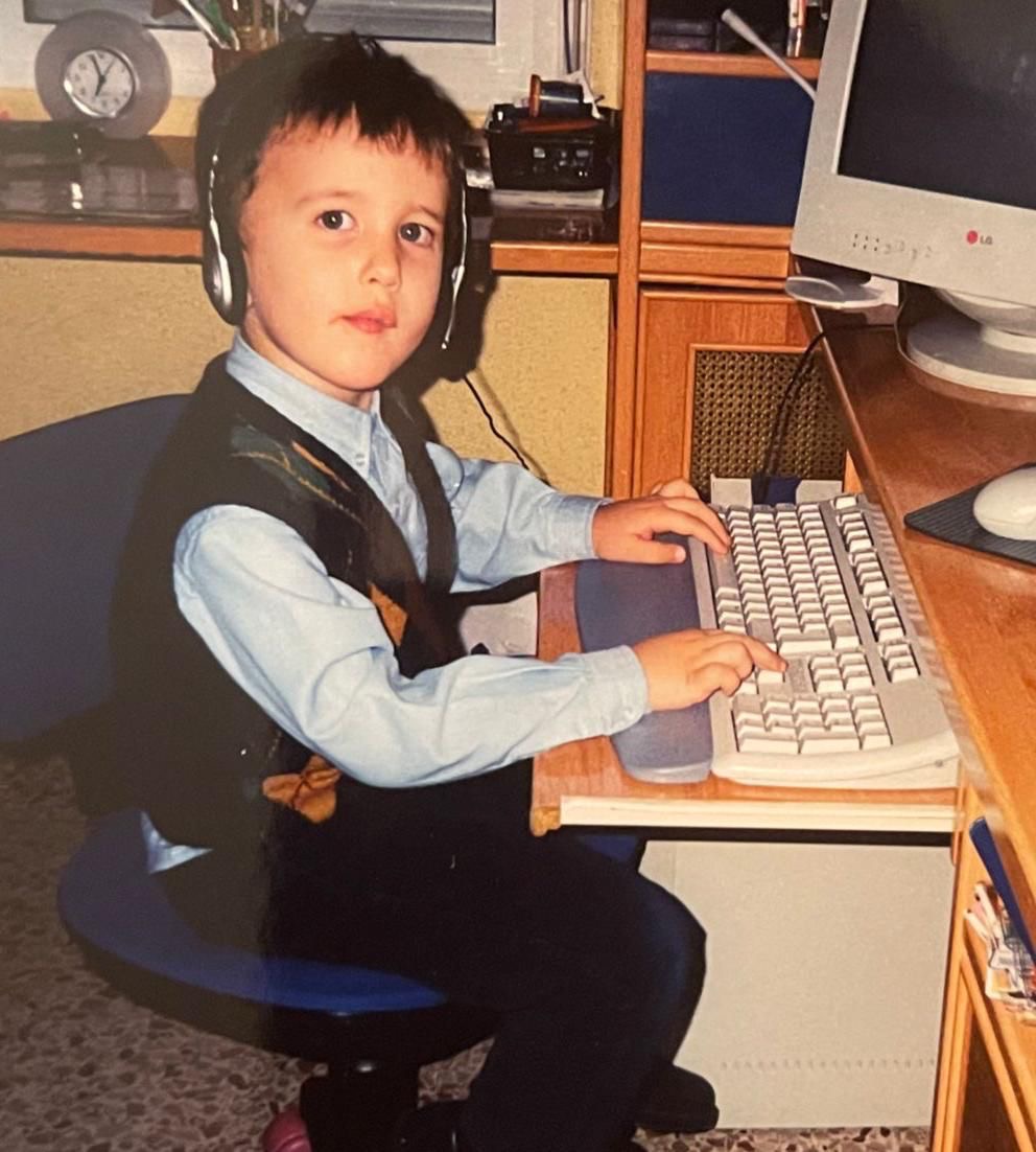
Color blindness was already in the family: my grandfather was colorblind and my mother is a carrier, so my brother and I had every number in the raffle. As a kid I had no idea what any of that meant.
I found out in art class, at a convent school. We had to draw the Virgin with the baby Jesus. Mine was going well until I ran out of the skin-coloured pencil, so the nun told me to fill in the features with the orange one I had left. I coloured the baby Jesus's face entirely green.
The telling-off was monumental. She was certain I was winding her up, that I had drawn her a Martian baby Jesus. Every drawing in the class ended up taped to the corridor windows. Mine was nowhere: she had thrown it away.
I got home half crying, and that is when my parents told me I was probably colorblind. It was confirmed soon after, and a lot of things fell into place: why I kept putting pink next to blue, or why green and brown live in the same place for me.
What nobody knew was what it meant. There was a boy in my class who kept away from me because he thought it was catching.
Twenty-nine years later it is the same, and every tool points the same way. When games started shipping colorblind modes I tried them and dropped them: they push the colors so far that nothing looks like anything any more. I do not see the world through a filter. I just see it like this.
So I am not looking for help seeing. I manage: there is the eyedropper in Adobe when I design something, and when I am unsure I ask somebody, which is warmer than a filter anyway. What I never had was an answer to the question everybody asks me, my parents, my partner: so how do you see?
That is what this app is. Not so that I can see the way you do, but so that you can see the way I do.
Try it
It came out on 6 September, Colour Blind Awareness Day. It is free, it has no ads and it asks for no account.
For iPhone. It asks for the camera when you open it, and that is all it needs: the divider, all three types and the sharing. If anything gives you trouble, write to me and we will sort it out.
How sharing works
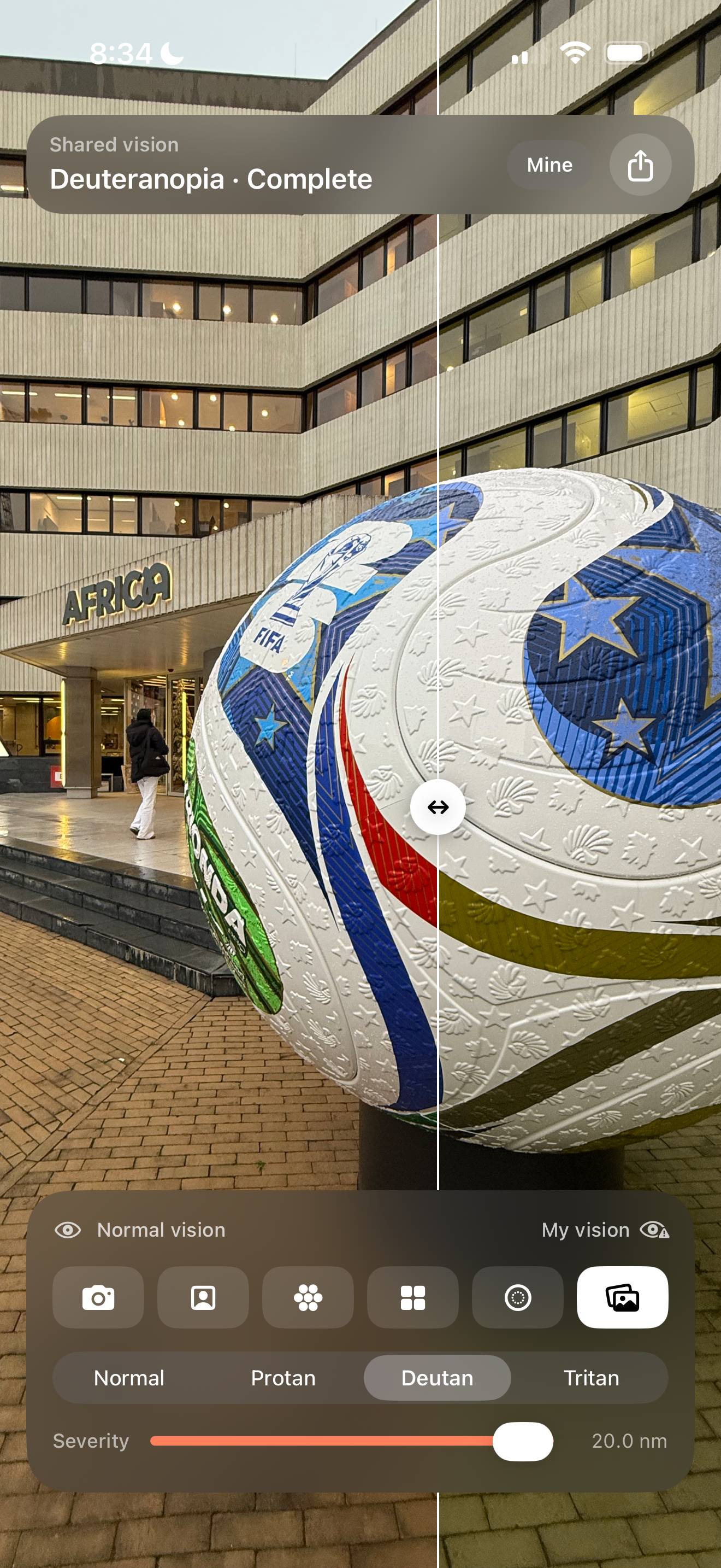
What a colorblind person shares is a link, and what happens when it opens depends on who opens it. With the app installed, the link opens the app with that profile already loaded, which is what the video shows. Without it, which is nearly everybody, a page opens in their browser with nothing to install.
Open the profile of a complete deuteranopia
That one is not the app: it is what somebody without it sees when the link arrives. Inside there is a dot plate with a 74 written in it, drawn twice: on the normal vision one you can read it, and on this person's it is not there. The whole profile is four bytes inside the URL itself, so there is no app, no account and no server behind that page.
Images
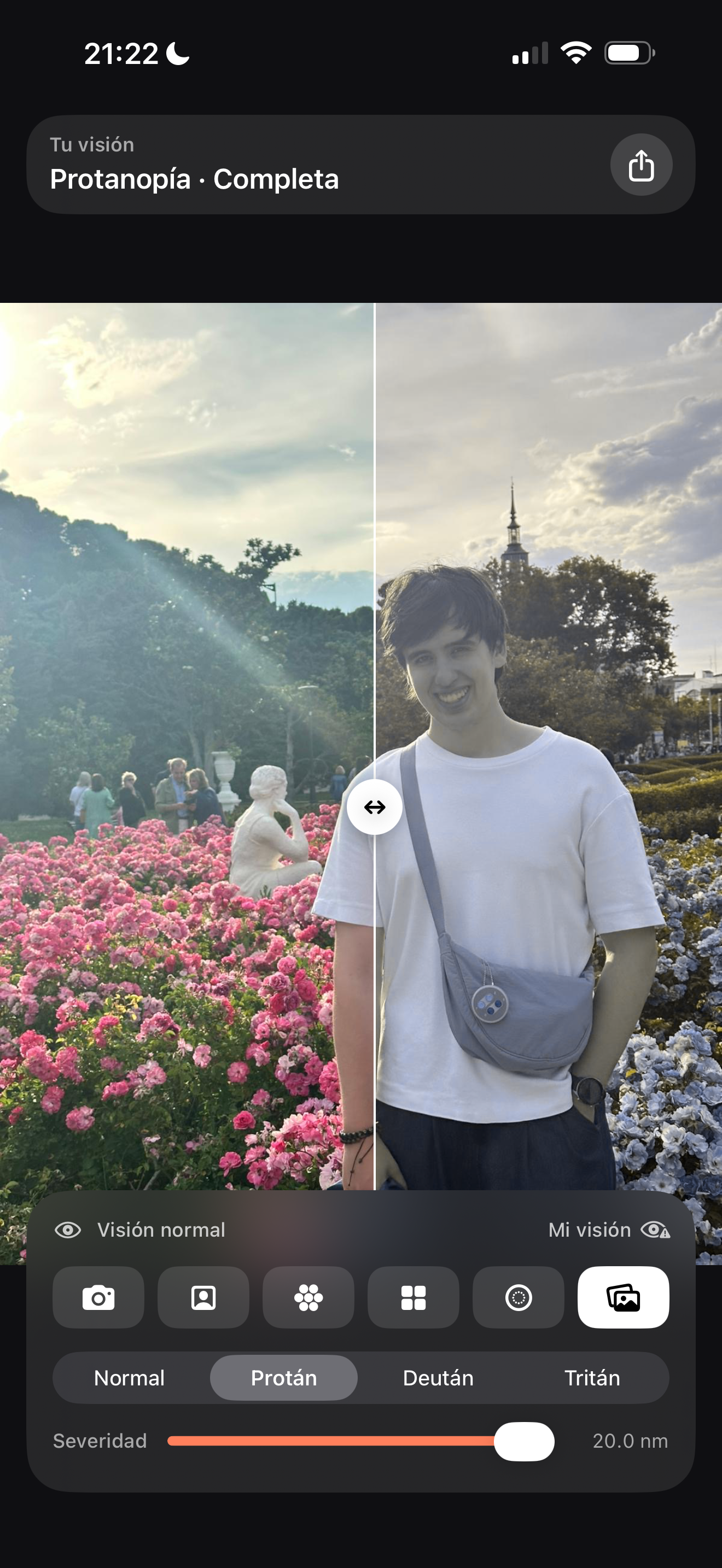
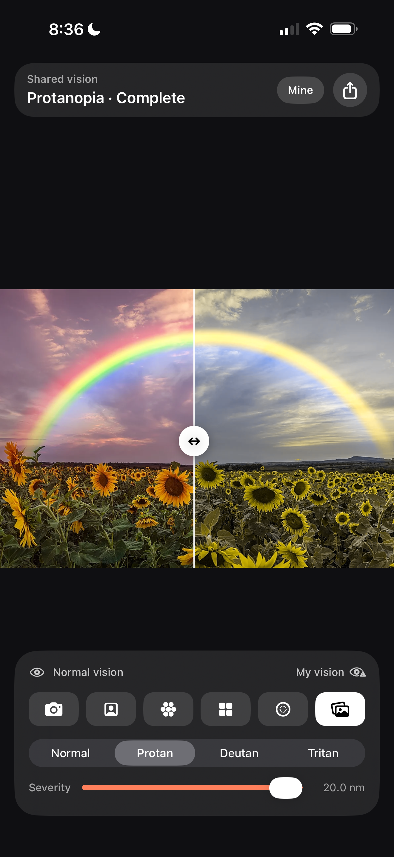
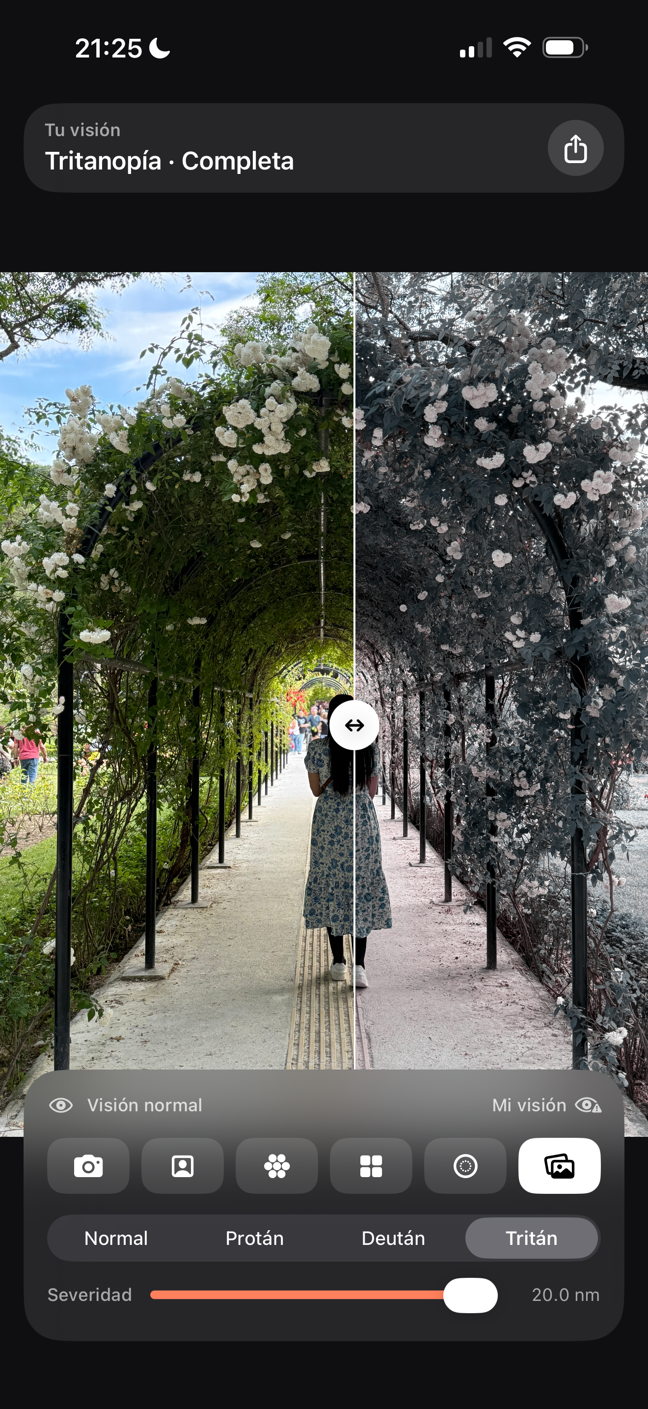
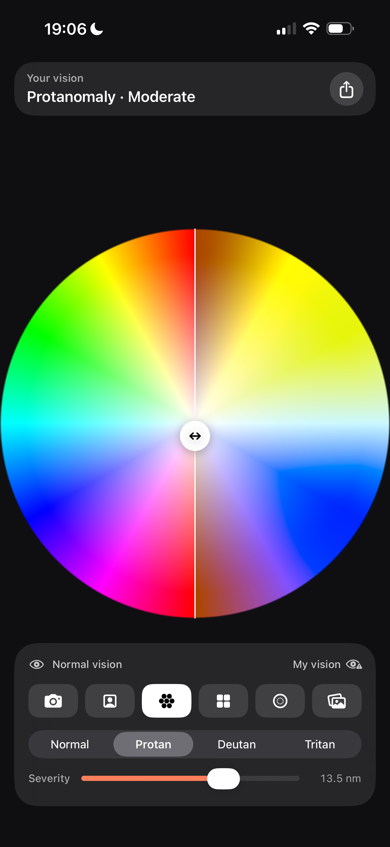
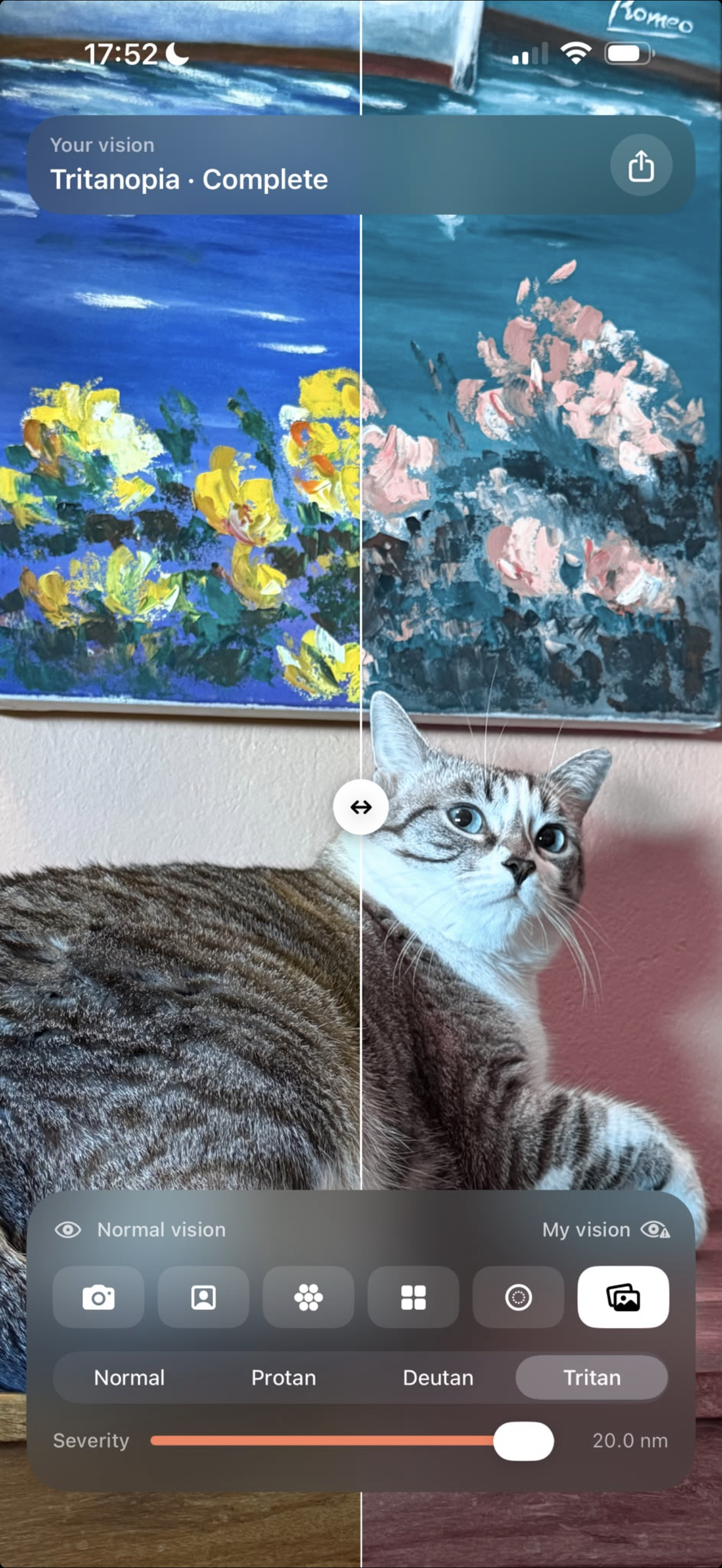
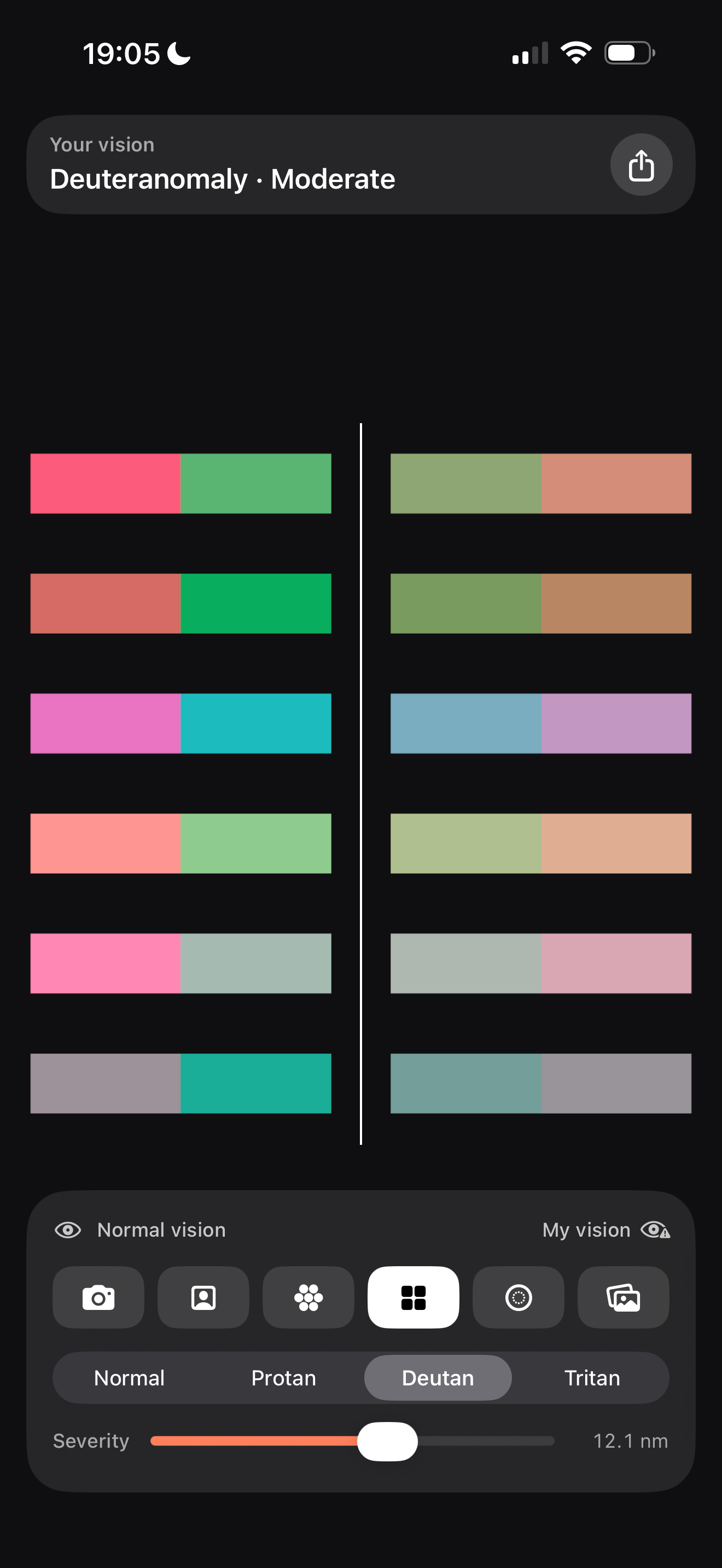
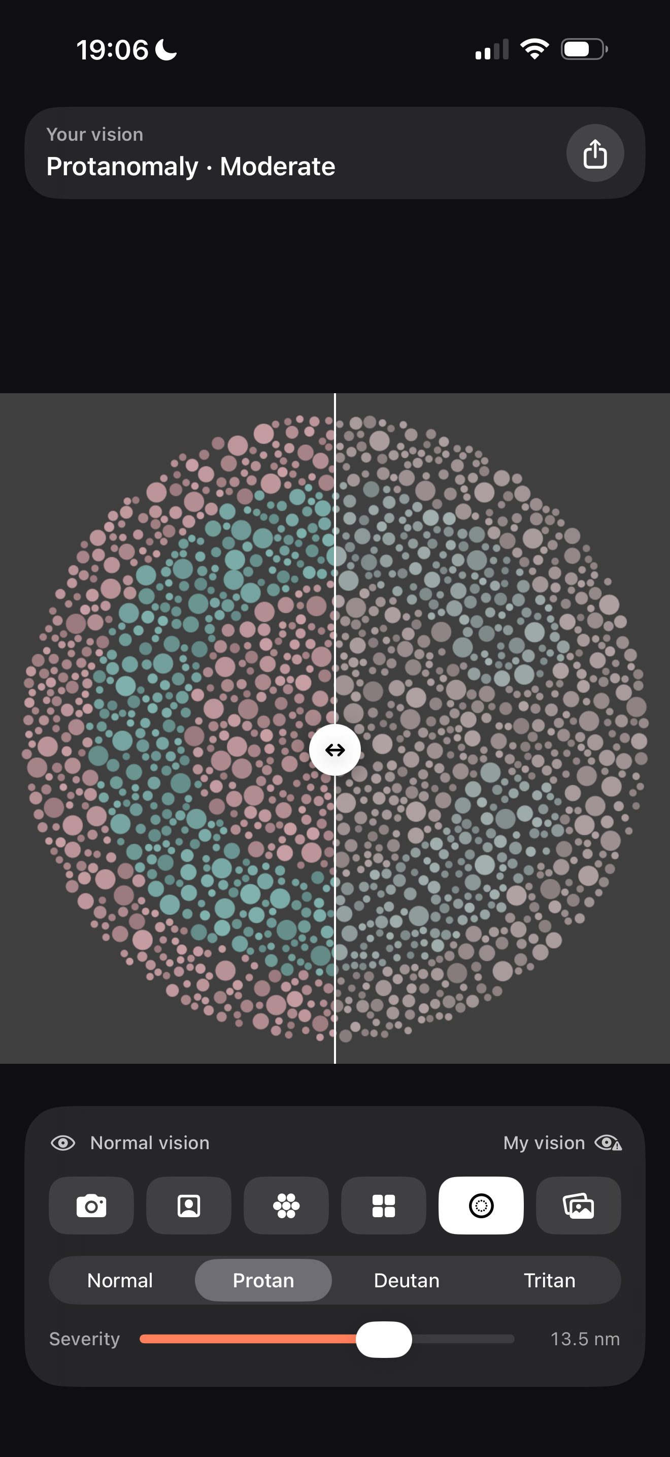
Click any of them to download the original: 1320x2868, PNG, sRGB, no alpha channel. In every one, the left half is normal vision and the right half is the simulated vision.
Each is named with its type exactly as the screenshot shows it, and the end of the word is not a detail: -opia is the complete form, where that cone does not work at all, and -omaly the partial one, where it works but shifted. The partial one is far more common, and it is what most colorblind people you know have.
Factsheet
- Name
- See as Me: Colorblind
- Who it is for
- Colorblind people, and whoever they want to show
- Developer
- Javier Jiménez Tomás, on his own. Four years teaching at Universidad San Jorge, three of them Computer Graphics
- Icon design
- Jorge Vizmanos
- Release
- 6 September 2026
- Platform
- iPhone, iOS
- Price
- Free, no ads
- Languages
- Spanish and English
- App Store
- apps.apple.com/app/id6799407092, free
- Contact
- javi@seeas.me · +34 635 321 651
In detail
Simulating color blindness was solved years ago and there are tools that do it well. They all point the same way: you look, and you check how something would appear. They are viewers.
This one turns it around. The colorblind person sets up how they see, and that stops being a mode inside an app and becomes a profile of theirs that they can send.
How it works
You pick your type, protan, deutan or tritan, and the severity, then point the camera at anything or open a photo. A divider you drag across the screen puts your vision next to normal vision.
What is underneath
The cones that see color respond with a peak at a particular wavelength, and what happens to a colorblind person is that one of those peaks has moved towards its neighbour, so two colors that are different to somebody else land in the same place for them. In the app the slider does not travel along that shift: it controls the severity of the simulation, from normal vision to the dichromatic end. All of it runs on the iPhone's graphics chip, over every frame of the camera, at 60 frames a second, so it moves live and without lag.
Put precisely enough to quote: the simulation implements the model of Brettel, Viénot and Mollon (1997). The colors a dichromat can tell apart do not form a plane but two half-planes hinged on the neutral axis. The usual simplification is to collapse them into a single matrix, which fails visibly on saturated blues and violets; here both are computed and one is chosen per pixel. Partial cases are approximated by interpolating between normal vision and that projection: a practical approximation rather than a model of a displaced photopigment, but one that is monotonic in severity and lands on the right endpoint. All in linear light, in sRGB from end to end, on Metal, at 60 fps, and it covers all three types.
The interface is built with Liquid Glass, the translucent material Apple rebuilt the look of iOS around from iOS 26 onwards: controls are no longer opaque panels but a kind of glass that shows and bends whatever sits behind them. It is not here for decoration: the controls float over the camera without covering the image, which is the thing you came to look at.
Privacy: no account, no server, and nothing stored about anybody. A shared profile is four bytes inside the URL itself, so the page that opens it has nothing behind it.
The way you set it
Move the severity until both sides of the divider look the same to you. That is your setting.
It works for a simple reason: if the simulation is close to your own deficiency, applying it takes away almost nothing you could have seen, so the two sides look much alike to you. Overshoot it and the simulated side dims in a way even you can notice.
It is an adjustment by eye, not a measurement. The simulation is an approximation, so the point where you stop seeing a difference is your own estimate rather than a clinical figure. It is still the most direct way for a colorblind person to reach a setting that represents them, and nobody with normal vision has to be standing there to confirm it.
The video shows it from the other side: anyone with normal vision watches the two halves of the wheel separate as the severity climbs. A protan would tend to see them converge, and can use the point where they barely notice a difference as a reference for their own setting.
Icon
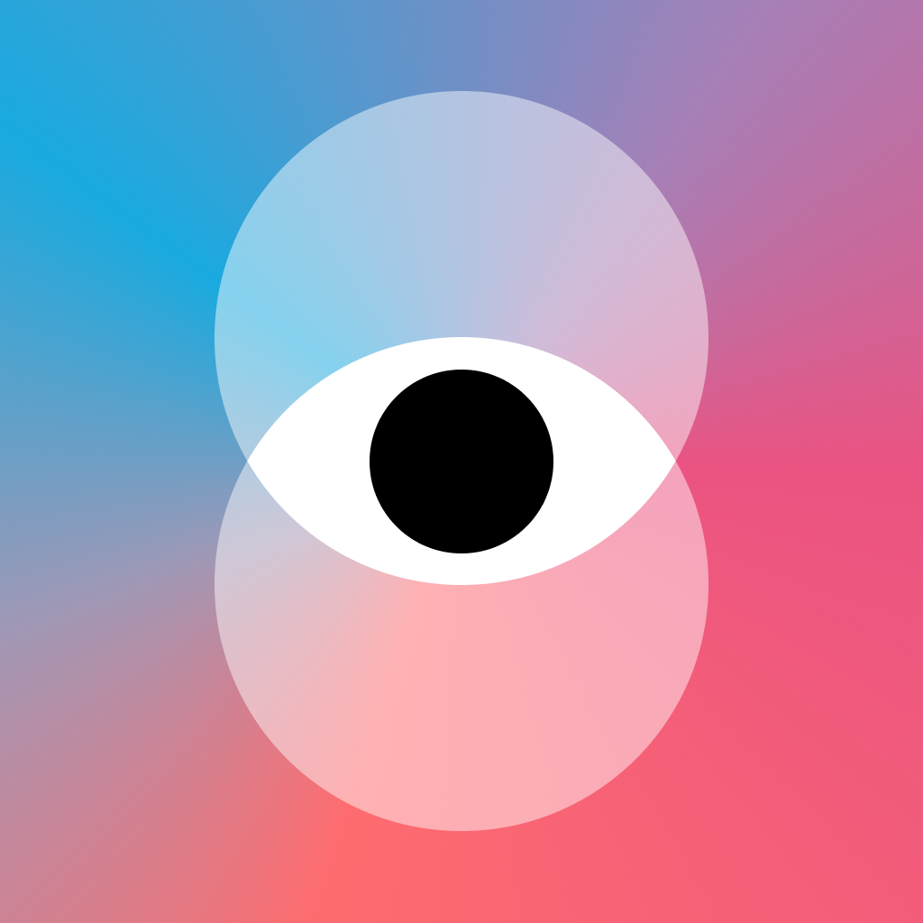
The icon was created by Jorge Vizmanos: two filters whose intersection makes a shared eye, one you can see both worlds through. They are translucent and blend where they overlap, the same glass idea as the interface.
1024x1024, PNG, sRGB, no alpha channel and no rounded corners, which the system adds.
Facts
- 1 in 12 men and 1 in 200 women have a color vision deficiency. Around 300 million people worldwide. Source: Colour Blind Awareness.
- Color Blind Awareness Day is 6 September, chosen because it is John Dalton's birthday (6 September 1766). He was the first to describe the condition, and the Spanish word for it, daltonismo, comes from his name.
- The whole of September is International Color Blindness Awareness Month, with museums, universities and libraries around the world taking part.
- Hashtags for the day: #ColourBlindAwarenessDay, #Iam1in12, #Iam1in200, #1inEveryClassroom.
What exists, and what does not
Something does, and it deserves respect: Chromatic Vision Simulator, by Kazunori Asada, a Japanese color scientist. Free, good, and on the App Store since 2012, with a live camera, all three types and an intensity control.
The difference is not in simulating better. That app shows the simulation on the screen of whoever opened it and it ends there: no profile, nothing to send, no way for a colorblind person to show somebody else how they see.
And before you can share it you have to get it right, which is the other half. Here you tune it yourself: pick the type, then move the severity until both sides of the divider look the same to you. That is what turns a generic simulation into one tuned to you, and that is what gets sent. One is a microscope, the other is a letter.
Contact
Javier Jiménez Tomás · javi@seeas.me · +34 635 321 651
I answer everything, and if you'd like to try it before release, just say so. I am in Zaragoza, Spain, so a call works too.